A simplified and powerful editorial experience
The state set metrics for improvement, aiming for a 30% reduction in stale content and an accessibility score of 83 or higher. Every site on the new platform meets or exceeds these KPIs, with some eliminating over 90% of content and achieving high 90s in accessibility scores.
A Scalable, Flexible Design System
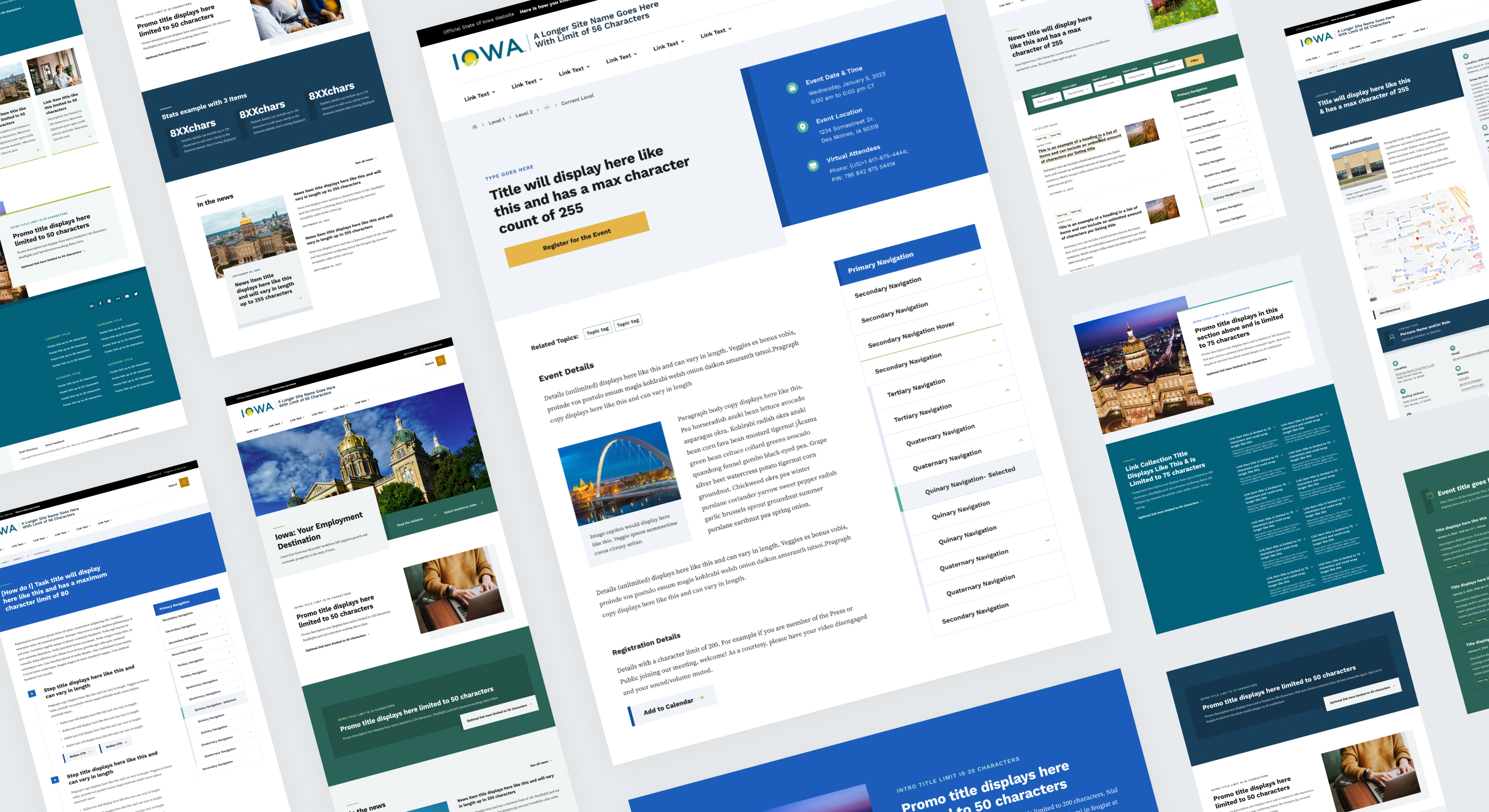
We prioritized the needs of content authors and public information officers, ensuring the new platform accommodates various team sizes and experience levels. The system empowers staff to automate and embed content while adhering to design and accessibility standards. Additionally, we standardized the insertion of videos, visualizations, and tables to meet agency requirements and enhance security.
A Gradual, Customized Migration
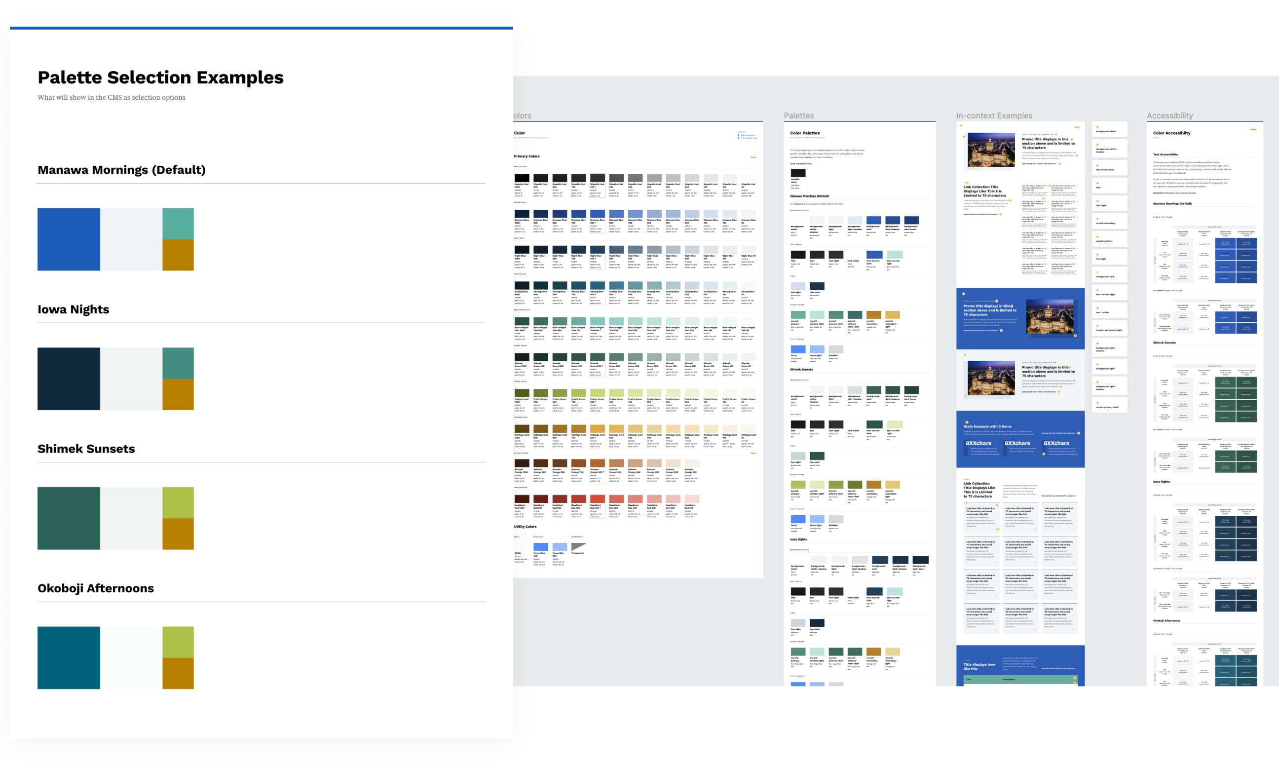
We expanded Iowa’s color palette to offer agencies more customization options while maintaining accessibility and branding. Visual documentation provides editors with patterns and sample layouts, ensuring consistency and reinforcing trust in agency websites.
Enhanced Performance and Security
Previously, agency websites were hosted with multiple providers, leading to maintenance issues, slow loading times, and outages. We conducted a needs analysis and recommended a new hosting solution. The unified platform on Pantheon features isolated instances for each site, enabling rapid launches and easy code updates, resulting in improved stability and security.
Measurable improvements
We migrated the state’s agency websites in groups, using both automated processes and manual entry. Each site underwent a comprehensive content audit and received a migration plan that worked best while identifying content gaps, redundancies, and outdated PDFs to maximize impact at launch.

