Digital strategy for an audience of millions
We also built a system of swappable color schemes based on the design system’s ten standard palettes. By combining dynamic CSS variables and in-CMS configuration options, every site built within GovHub can have a custom palette while running on the same shared templates.
- What were their pain points?
- How did the state’s websites fit into residents’ daily lives?
- What unmet needs did agency staff “in the trenches” hear about from Georgia’s residents?
The final product was a toolbox of components that agency staff could combine in novel ways without breaking the overall design. This eliminated the need for custom HTML and CSS hacks when building complex pages for unique events and state programs.
- Create the initial inventories before organizing them
- Identify usage patterns across different agencies
- Spot accessibility and design problems that would affect migration
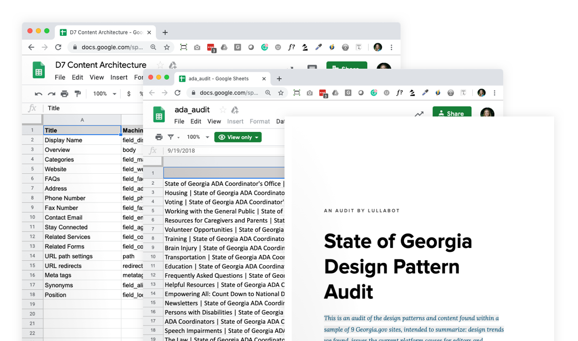
- Compile pre-populated “audit checklists” for each agency’s staff
The result was a completely re-imagined content model that ensured consistency and streamlined common patterns like step-by-step tutorials and legal announcements. A new landing page design tool, built on top of Drupal 8’s Layout Builder, gave agencies the power to customize their home pages, landing pages, and programs without breaking the mobile-friendly responsive design. The platform’s foundation of structured content made it possible to keep critical information up-to-date across agencies, and automatically expose rich metadata for search engines.
But we also needed to know how the old Drupal 7 platform was being used. We did content audits and generated extensive content inventories. The scale of Georgia’s web ecosystem made it impossible to build manual lists of pages, so we developed custom tools to:
Creating the Orchard Design System
The improved content model streamlined some tasks, but one-off content like sitewide landing pages and portals were a significant concern. We extended Drupal 8’s Layout Builder and added simplified controls for content editors, integrating it with the Orchard design system. This made it easier for site managers to build custom pages but ensured that any one-off scenarios wouldn’t break design and accessibility.
IDEO created a fresh brand and identity to unite all of the agency sites under a shared look and feel while we fleshed out a complete pattern library. A comprehensive typographic system was implemented, which improved readability across devices and contexts without sacrificing site performance.
We interviewed dozens of state agency staff, Georgia residents, and key governmental stakeholders and asked some of the following questions:
Building a robust publishing platform
Additionally, we built a custom asset management system on top of Drupal 8’s file and media APIs to give site managers a way to store, distribute, and schedule the release of important state documents. The system also enables site managers to automate publishing before releasing new regulations and announcements, and it centralizes thousands of existing state documents for consistency.
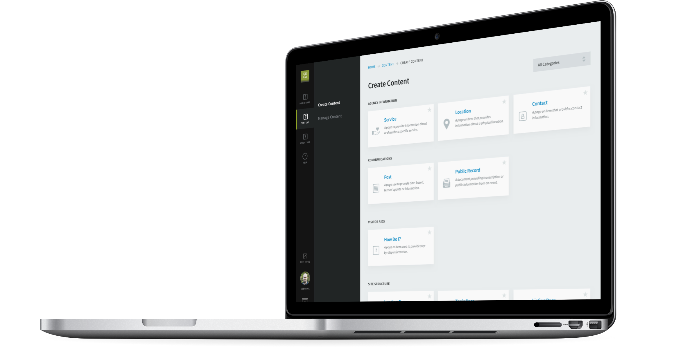
We worked with the DSGa team to tease apart their most important content, workflow, and governance challenges, with a focus on flexibility.
Because there was no centralized content team, making publishing as simple as possible was a top priority.
With the platform prepared, a phased rollout began, starting with the MVP sites and building to more complex sites in parallel with continued feature development. We rolled out 75 sites (after some merging and consolidation) over 12 rounds, approximately 6 to 7 every three weeks. Each three-week cycle involved standing up new sites, acquiring migration data, migration QA and bug fixes, new feature development, coordination of final migration runs, and decommissioning sites that have launched—all while continuing the effort for future iterations. Detailed planning, project management, and communication were key to managing this complex rollout process.
